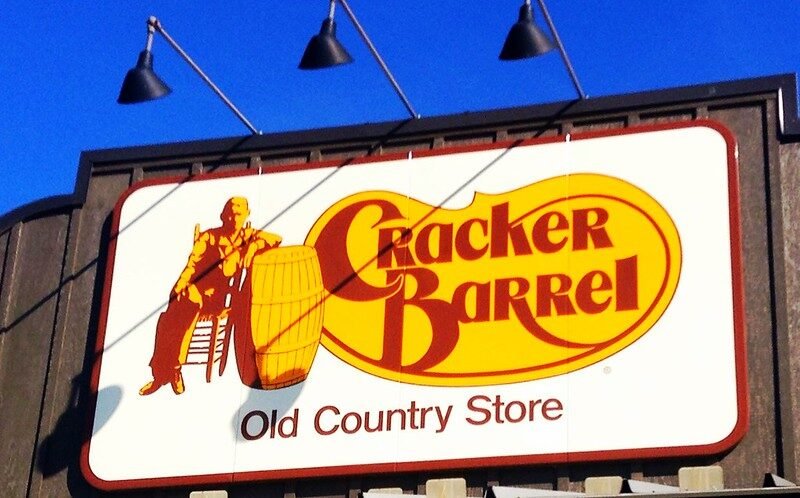
Image curtesy – Cracker Barrel, by Mike Mozart
Cracker Barrel Unveils First New Logo in 48 Years, Pairs Rebrand With Fall Menu Push
Cracker Barrel has introduced a new, simplified logo—the first major redesign since the late 1970s—retiring the long-familiar illustration of a man leaning against a barrel in favor of a cleaner, text-forward mark in the brand’s traditional warm palette.
Company leaders describe the update as part of a broader refresh aimed at keeping the roadside chain relevant without losing its homestyle identity. The rollout arrives alongside a seasonal menu built around comfort-leaning fall items.
What’s changing
The illustrated figure and barrel motif are gone from the primary mark; the new identity emphasizes the wordmark for clarity on signs, packaging, and smaller digital screens.
Store remodels and refreshed marketing accompany the change, with the chain signaling a “modernized but familiar” in-restaurant experience.
What’s staying the same
Core positioning around country-style hospitality, a general store up front, and the sit-down, comfort-food menu that regulars expect.
By the Numbers (Context You Asked For)
Logo tenure: ~48 years (the previous design dates back to the late 1970s).
Company age: Founded in 1969 (Lebanon, Tennessee) — 56 years old in 2025.
Footprint: ~660 restaurants across ~45 states.
Timing: New logo publicly revealed August 2025, aligned with the chain’s fall menu launch.
Fall Menu Highlights
Cracker Barrel is using the attention around the rebrand to spotlight limited-time items, including:
Butter Pecan French Toast Bake
Hashbrown Casserole Shepherd’s Pie
Cinnamon Roll Skillet (served hot)
Brown Sugar Latte
Herb-Roasted Chicken (select locations)
Why a Simpler Logo (and Why Now)
Digital legibility: Restaurant brands have moved toward cleaner, bolder wordmarks that scale better on phones, apps, map pins, and delivery listings.
Category pressure: Casual dining has been navigating traffic softness while fast-casual concepts expand. Industry trackers have shown low single-digit declines in sit-down visits year-over-year, versus low single-digit growth for fast-casual—putting a premium on brand clarity and differentiation.
Promotions and LTOs: Pairing a rebrand with seasonal launches can deliver a short-term traffic lift as guests sample new items and form fresh impressions of the brand.
Reaction So Far
Response has been mixed. Some longtime guests say the old illustration felt personal and nostalgic; others welcome the streamlined look and see it as overdue. Early sentiment suggests most diners will ultimately judge the change at the table—on food, hospitality, and value—rather than at the roadside sign.
What to Watch Next
Guest behavior: Do fall promotions and a cleaner brand image translate into higher visit frequency or check growth through Q3–Q4?
Operational follow-through: Are store refreshes and menu cadence consistent enough to sustain interest beyond the initial logo moment?
Loyalty/digital: Expect tighter integration of the new identity across app, email, and ordering—areas where simplified marks typically perform best.
Bottom Line
After nearly five decades with the same emblem, Cracker Barrel is putting a modern face on a legacy brand while betting that familiar comfort food will keep regulars on board. The details—cleaner signage, seasonal dishes, incremental store updates—are small on their own, but together they signal a chain aiming to protect its roots and compete for the next generation of roadside diners.


